 New York edged closer to telling city dwellers how many people have tested positive for novel coronavirus in their communities with new, slightly more detailed, maps released Wednesday.
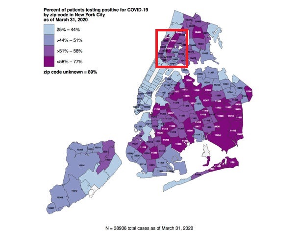
The two new Health Department maps break down COVID-19 case number ranges and percentages of patients testing positive as of March 31 by zip codes.
The maps do not show an exact number of cases or the percentage of the population who have tested positive per zip code.
The data is based only on those who have received tests, which have become increasingly difficult to procure.
The data suggest Brooklyn and Queens have been hit hardest by the pandemic, with only one Manhattan neighborhood reporting the highest percentage range, between 58 and 77 percent.
More than 40 zip codes — predominantly in Brooklyn and Queens — have between 304 and 947 residents test positive for COVID-19, according to the map.
The Health Department released the map days after reporters hurled please for greater transparency at Mayor Bill de Blasio.
“You have to release more detailed data on cases and deaths,” Katie Honan told de Blasio. “It’s negligent that you’re not … please, everyone has to get this data.”
While de Blasio argued it would be irresponsible to release quickly-changing data, the next day the Health Department produced a difficult-to-interpret map of novel coronavirus cases in New York City.
Photo credit: 1-2) Harlem/uptown in red. New Yorkers can now find out how many cases of COVID-19 have been confirmed in their neighborhood. (NYC Health Department)
Become a Harlem Insider!
By submitting this form, you are consenting to receive marketing emails from: . You can revoke your consent to receive emails at any time by using the SafeUnsubscribe® link, found at the bottom of every email. Emails are serviced by Constant Contact
