 Harlemites spend a lot of energy lamenting the fact that the rent is too damn high, and they aren’t wrong to do so. Harlem rents have been steadily rising for more than a year.
Harlem rents have been steadily rising for more than a year.
Escalating rents go hand-in-hand with gentrification, a topic that is only getting more contentious as the new-building boom—and with it, almost inevitably, even higher rents—creeps deeper into the outer boroughs.
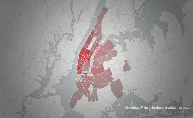
To chart the changes, Curbed created an interactive map that shows both the median rents in New York City neighborhoods right now as well as their evolution in those areas over the last seven years—a period that has been marked by significant new development. In short, deeper red equals more expensive rents. Their friends at StreetEasy provided the median rental data in select areas for every year since 2009—including year-to-date information for 2015—as well as the neighborhood boundaries. A close examination reveals some interesting, though not that surprising, trends.
But first, some background: StreetEasy started tracking rents in New York City in 2008, and the data the listings site provided for this map goes back to 2009. The numbers represent the median rent for each neighborhood over an entire year, except for the 2015 figures, which were calculated as of mid-May. Click on a neighborhood to see a chart showing how rents have changed over time. The red box in the righthand corner of the map is a drop-down menu so that you can elect a year in scope to examine the rents citywide.
Keep in mind that this data comes only from the listings posted on StreetEasy. So while the volume of listings that site sees means it paints an accurate picture of the rental landscape, it is not representative of every single rental listing in New York. For two neighborhoods, East New York and Manhattanville, there are a couple of earlier years where StreetEasy lacked enough data, so they appear blank on the map. For this same reason, the map doesn’t venture into the Bronx, Staten Island, or deep into Queens.
The shading on the map indicates the priciness of the neighborhoods.
The cheapest areas are located farther into Brooklyn, Queens, and northern Manhattan, but all neighborhoods turn a richer red as you click through the years, showing that rents have indeed climbed across the whole city over time.
The cheapest areas are located farther into Brooklyn, Queens, and northern Manhattan, but all neighborhoods turn a richer red as you click through the years, showing that rents have indeed climbed across the whole city over time. Not a single neighborhood is cheaper than it was in 2009. However, the effect of the market crash is evident; the median dipped for almost all areas in 2010.
But there are still bargains to be found. The current median rent in Manhattanville is only $1,695, and in “the next frontier” of gentrification, a.k.a. East New York, it’s just $1,600.
If anything, yes, the map does confirm the omnipresent woes of New York’s affordability crisis. But it also helps break down the general trend of high rent by neighborhood, allowing you to note trends and zoom in on the places where the riseshaven’t been so acute. And more data makes for a more informed renter, right? So please, go on and explore.
This article has been edited from the source.
Become a Harlem Insider!
By submitting this form, you are consenting to receive marketing emails from: . You can revoke your consent to receive emails at any time by using the SafeUnsubscribe® link, found at the bottom of every email. Emails are serviced by Constant Contact
