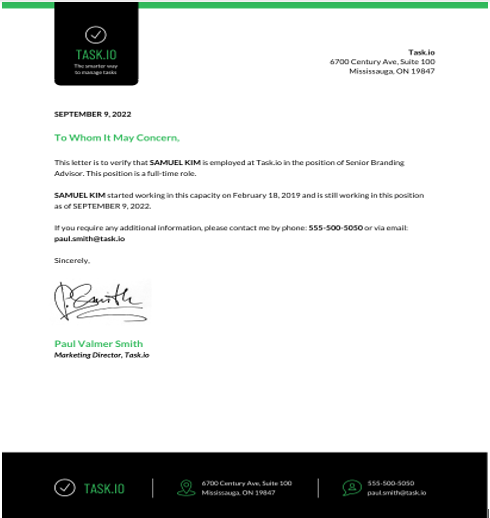
What is a letterhead design? Letterhead design is a critical part of your identity and branding.
It can make your company look professional and cohesive or unorganized and sloppy. Making the wrong choices when designing letterheads can be costly in terms of money, time, and business performance.
Here are 12 mistakes to avoid when you’re planning on creating a new letterhead template:
1. Not thinking about your audience
When you’re creating a letterhead, it’s important to think about your target audience. What design will appeal to them? If you don’t take this into account, you may wind up with a design that doesn’t resonate with your customers or clients.

2. Using a bad font for your letterhead examples
Your letterhead is not the place to experiment with new fonts. The font you choose for your letterheads should be readable and in a style that doesn’t detract from the design or appear unprofessional in any way. Also, make sure it’s in an appropriate weight for printing on standard paper stock.
3. Using your logo in the wrong places
Logos, where they should appear, and the size to which they should be resized are largely dependent on company size and budget. The rule of thumb for smaller companies is that, if you can fit your logo in one color on the letterhead, do so. If you have a bigger budget, you can use your logo more prominently. Just make sure it’s placed in an appropriate spot and sized correctly so it doesn’t overpower the design.
4. Not using a template
There are countless free letterhead templates out there that you can use as a starting point for your design. By using a template, you’ll have a better idea of the correct formatting and layout to use, as well as a headstart on the design process.
Visit Venngage to view and use more letterhead templates.
5. Not using a professional designer
If you’re not confident in your design skills, it’s best to leave the job to a professional. A good designer will be able to help you create a letterhead that is both visually appealing and on-brand for your company.
6. Not using the correct paper stock
Not using the right paper stock can ruin the overall effect of your letterhead design. Make sure to choose a weight and finish that is appropriate for the type of printing you plan on doing. Also, be aware of any special considerations, such as watermarks or embossing.
7. Focusing too much on your logo
If your letterhead design is more about the logo than the content, you’re missing out on a great branding opportunity. Your goal should be to make an impact with clients and customers by providing inspirational or helpful content that will resonate with them. A beautiful design isn’t anything if it doesn’t accomplish that.

8. Not printing a personal letterhead for yourself
In the modern business world, it’s common practice to email instead of sending physical mail. While this has cut costs and increased efficiency, it has also led to a decrease in the quality of communication between businesses and their customers or clients. You can combat this by going the extra mile and sending a personal letter to your customers. Make sure you do this by printing a personalized letterhead design for yourself that matches the company’s branding.
9. Not having an effective call-to-action for your business letterhead template
You should always include some type of CTA on your letterheads, whether it’s an email address or a request to visit your website. If you don’t have a call-to-action, your recipients may not know what to do with the information you’ve given them.
10. Making the letter designs too busy
If there’s too much going on in your letterhead design, it will be difficult for the reader to focus on any one element. Keep your design simple but effective. This will make it easier for your customers or clients to read and understand the information you’re trying to communicate.
11. Not using a standard size
While there is some flexibility in terms of the size of your letterhead, it’s best to stick to a standard size so that all of your recipients will be able to print it out properly. Standard sizes are 8.5″ x 11″ for North America, A4 for the UK and most of Europe, and DL for Germany.
12. Not including key information for your company letterhead template
Don’t forget to include all of the standard contact details, such as your company name, address, email address, phone number, and fax number. Also, make sure not to neglect any social media links. These days it’s common for clients and customers to check you out on Facebook, Twitter, or Google+, so you may want to include these in your letterhead design.
Bottomline
A letterhead template can help you create a beautiful design for your company’s official documents. Just be sure to avoid making these common mistakes: ignoring branding, focusing too much on the logo, and not including key information.
Photo credit: 1-2) Venngage.
Become a Harlem Insider!
By submitting this form, you are consenting to receive marketing emails from: . You can revoke your consent to receive emails at any time by using the SafeUnsubscribe® link, found at the bottom of every email. Emails are serviced by Constant Contact


